
Nordstrom
Nordstrom is a popular fashion retailer offering a wide selection of clothing, shoes, beauty products, and services for men, women, and children.
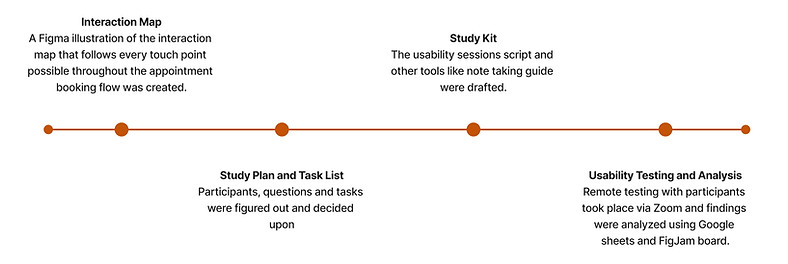
This project was done in for the Usability Studies with University of Washington during Jan 24 - Mar 24.
Project Brief
Role
Usability Researcher
Duration
10 weeks
Stakeholders
Nordstrom
Collaborators
Alisha Mudbhary, Seamus McPeake, Jinzhao Chen
Context
Where would you go to get styled for your next event?
In addition to retail shopping, Nordstrom offers beauty and tailoring services for in-store appointments and home visits. Lately, they were experiencing high drop-off rates for their services flow online.
Objectives
This study aims to evaluate the experience, discoverability, and awareness of Nordstrom’s online appointment booking flow for their free personal styling service.
01
Is the existence of appointment booking intuitive and apparent?
02
What parts of the appointment booking process are frustrating users?
03
What factors contribute to the high drop-off rate during the stylist appointment booking process on Nordstrom’s website?
Timeline
The project followed a bi-weekly call with the client. We collaborated on shared documents and taken into account the feedback made by UXRs at Nordstrom and Usability Studies professor Sean Munson.

Users

What did the usability study find?
SUCCESSES
#1 The appointment booking process in itself is very easy and intuitive for a typical user to follow through and complete.
Users across ages do not find it difficult to go through the steps of booking the appointment themselves, suggesting that it is not the technical issues that would make a user drop off from the website while making an appointment.
#2 Users appreciated having a diverse variety of stylists to choose from.
Users did seem to spend quite some time picking up a stylist that matched their styling needs, gender, age, and ethnicity since they believed these factors were essential for the stylist to understand the customer better.
#3 Additional Information was an important section for users to update the stylists about their personal preferences or constraints beforehand.
They also liked having an open-ended section to share additional information about themselves, their sense of style or personal details like religious or cultural constraints.

ISSUES AND RECOMMENDATIONS
#1 Discoverability and Findability are significant challenges, all participants made at least one error while trying to find the styling services page.
CRITIAL SEVERITY
1.1. The navigation bar followed by the category links are where users go first to look for stylist appointments.
On the Nordstrom homepage, the main navigation bar was the initial point of reference for half of the participants. However, they tended to first explore links categorized under 'Mens', 'Womens', and 'Designers' before navigating to the ‘Explore’ section, where the Styling Services link is located. This behavior indicates a potential mismatch between user expectations and the site's navigational structure.
Recommendation:
Users did seem to spend quite some time picking up a stylist that matched their styling needs, gender, age, and ethnicity since they believed these factors were essential for the stylist to understand the customer better.
1.2. Participants relied on interactive tools like the search bar and the chatbox when getting stuck.
When users enter 'styling' in the chat box, they are not directed to Styling Services but instead to the Stylist Directory. This misdirection further complicates the discoverability issue.
Recommendation:
Enhancing the chatbot's functionality to recognize queries like ‘styling’ and providing a direct link or guidance to the Styling Services page is recommended.

Female, 26 years old participant using chatbot for completing the task

Male, 54 years old participant using search box for completing the task
1.3. Ambiguity in terminology compounded the discoverability challenge.
During the study, the description of the service to participants intentionally avoided using specific terms like “stylist” or “styling.” The objective was to determine if users could independently associate the service with these terms. However, it became evident that most participants were uncertain about the appropriate terminology for a service involving assistance in selecting clothes.
6 out of 8 participants confused styling services with other similar site features. They initially clicked on options like “Style Quiz,” “Fashion Inspiration,” and "Request a Look" before selecting “Book an Appointment,” indicating a disconnect between user expectations and the service's nomenclature on the site.
Recommendation:
The confusion among users regarding the naming of similar services suggests a need for more explicit and intuitive terminology. For example, renaming 'Fashion Inspiration' to ‘Reads on Fashion Advice’ or 'Style Savvy Zine' can delineate it more clearly from styling services. Similarly, changing ‘Request a Look’ to ‘Style Mail’ or 'Inbox Style Picks' would help distinguish it from styling services as well.
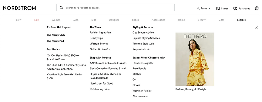
What users see when they click 'Explore' from the navigation bar
#2 When choosing a service, headings only help learn about the type of service being provided, forcing them to read the description which is not desired.
MINOR SEVERITY
2.1. Users do not want to engage in reading the page content and that creates a lack of understanding about the service.
On the page where users select a service, participants successfully navigate to the appropriate service ('In-Store Styling'), distinguishing it from other options like alterations. However, the think-aloud practice and subsequent interviews revealed a significant trend: users were not thoroughly reading the page content. This was considered a minor severity issue as it didn't lead to frustration or abandonment but did create an information gap.
This gap became evident when two users selected the paid services over the free ones. They assumed these paid services would be of higher quality. However, had they read the page headings more carefully, they would have understood that these were part of the 'Nordstrom to You' service, where stylists visit the client’s home.
Further emphasizing this point, half of the participants in the post-test interview admitted to a lack of understanding about the details of the services offered despite the presence of descriptive text on the page.
Initial reactions to the page also indicated that the amount of text was overwhelming for users, signaling a need to balance information delivery with clarity.
Recommendation:
Streamline and Refine Headings: The headings on the page require simplification and consistency to aid user comprehension. For example, transforming 'In-Store Styling: Women’s Fashion Expert' and 'Womenswear: In-Home Closet Consultation' to 'Women’s 1:1 In-Store Personalized Styling' and 'Women’s 1:1 At-Home Personalized Styling' respectively, can clarify the distinction between in-store and at-home services while highlighting the personalized aspect.
Introduce Hover Tooltips: Hover tooltips for each styling service could be a useful feature to tackle the issue of information overload while still providing necessary details. These would offer concise explanations when users hover over a service, reducing the need for lengthy paragraphs while still delivering key information.
Revise Descriptive Text: Replacing vague phrases in the service descriptions, such as “hit refresh on your style needs,” with more concrete details can help users better understand what to expect.
#3 Participants appreciate being able to select a stylist based on the provided information; however, the presentation of the information could be improved.
MINOR SEVERITY
2.1. Users do not want to engage in reading the page content and that creates a lack of understanding about the service.
In this step of the flow, users were required to select a stylist. The test revealed that most participants (6 out of 8) had specific preferences when choosing a stylist. Factors such as gender and age, discernible from the stylist's images, played a significant role in their decision-making process. Additionally, the descriptive information provided about each stylist was found to be valuable.
However, a challenge arose with the layout and density of information on the stylist selection page. Participants reported feeling bombarded by the amount of information crammed into a small space. This led to a behavior where many participants frantically scrolled up and down, attempting to compare different stylists. The current format seemed to complicate the decision-making process rather than facilitate it.
Recommendation:
Optimize the interface by allocating a dedicated page for stylist profiles. This layout allows users to easily access and review each stylist's details, including experience, specialization, and personal styling philosophy, without the need to navigate away from the page.

Selecting a Stylist based on the user preference
#4 Going from location to confirmation without choosing a time leaves the user confused and wondering if they have already booked the appointment.
MINOR SEVERITY
After picking the location and the service, the user gets shown a page confirming their selection. This confuses the user and makes them wonder if they have already booked their appointment. Confirmation of booking appointments prior to choosing important factors like stylist, date, and time feels out of place. It confuses the user, which is unresolved until they have hit ‘Next’ and realize they are only halfway through the process.
This also shows that while filling out the information, the user is not focusing on the breadcrumbs of the flow mentioned above, telling them how many steps remain in completing the process.

Recommendation:
Optimize the interface by allocating a dedicated page for stylist profiles. This layout allows users to easily access and review each stylist's details, including experience, specialization, and personal styling philosophy, without the need to navigate away from the page.

Male, 36 years old participant getting confused landing up on the confirmation page
#5 Filling Out Additional Information page was challenging for users to add information due to unmet information needs.
CRITIAL SEVERITY
After having filled out the basic information about themselves, the user proceeds to fill out open-ended and style-based information that would aid the stylist in making a better decision about their clothing options at the store. There were common pitfalls for the users in a few sections while filing their information out.
5.1. What words would you use to describe your style?
Users did not know how to articulate their style; they felt stuck at this step and spent time looking at the screen and then picking up a word from the suggestions.

Open-ended space to describe the unique styling preferences
Recommendation:
Adding visual cues like images of different styles would become helpful for the user to select their style and reduce the cognitive load of thinking up words. This would engage them to make more informed choices that are not possible when users find it hard to articulate their thoughts.

Adding Style Quiz would be a more interactive way of looking up styles that the user would more resonate with as their own
5.2. Add your sizes.
Users, while selecting their size, got confused by just symbols like S, M, L instead of explaining what the size would entail since they mentioned that different brands sometimes have different meanings for different size options.

Picking up the size for different garments lacked size guide
5.3. How much do you want to spend on clothes?
When adding the budget for each pair of clothing, users particularly students or those who were not going to the store with the intention to spend a lot did not feel comfortable picking out either of the choices for the budget. 3 participants felt that the options were too restrictive as well and ideally, they would have preferred to enter their own budget.

Selecting the price cap for your budget for each clothing category
Recommendation:
Introducing a range to the budget instead of forcing them to pick from a few predefined choices would give the user a sense of control while making the decision.
DROP-OFF POINTS
Learnings
Craft a More Detailed Scenario
The data analysis revealed challenges among participants when attempting to switch stylists after encountering availability issues. Rather than utilizing the provided button for stylist alterations, some participants tried to navigate back or attempt to delete the service. This variance in participant actions shows the importance of collecting comprehensive data on the usability of the stylist-change feature within our prototype. We could design scenarios that lead to a stylist change. For instance, prompting participants with a scenario where they receive a recommendation for a different stylist from a friend before moving to confirmation. This scenario design would ensure all participants need to navigate the stylist change process, allowing us to gather more targeted data on this functionality.
Integrate a Checklist of UI Terms in the Moderation Script
One task focused on the discoverability of the service. We aimed to reveal minimal information to observe if participants could independently locate the service, carefully avoiding the use of UI terminology unless first introduced by the participants. However, this approach occasionally led to distractions. It would have been helpful to incorporate a section in our script that lists UI terms. This would not only allow us to track when participants use specific terms but also serve as a quick reference to remind us of the acceptable vocabulary during the sessions.
Ask difficulty-rating questions after each task
The project involved two primary tasks: identifying the entry point for booking an appointment and completing the booking process. Initially, we sought participants' difficulty ratings in a post-test interview. However, given the varying challenges of these tasks, we noticed a tendency among participants to forget the difficulties encountered in the initial task when providing their ratings. Some participants showed a preference for evaluating the tasks separately. To collect more accurate reflections on each task's difficulty level, it would be beneficial to request these ratings immediately following each major task.